
For those of you who read last week’s email, I have good news. This one is much shorter!
This is the third in my virus series. You may want to check the others for background.
https://www.thenumberscoach.com/covid-19-predictions/ (sent March 20)
https://www.thenumberscoach.com/covid-19-update/ (sent March27)
I have a cool new tool to show you, but first a quick update on the US trends.
Really good news – the curve finally bent some … meaning the growth (while still exponential) is not as rapid as it had been
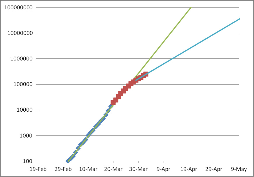
Check the articles above for an explanation of the curve.
The new thing is the blue line going off to the upper right. This is a whole new trajectory compared to the green line extrapolated from earlier data. All the social distancing and shutting down America is having an impact.
My Biggest Frustration With This Data (and what I did about it)
This curve shows the whole US as though it were one outbreak. But of course, it isn’t. It’s thousands of little outbreaks, all growing at their own rates. It was frustrating not having the right data, and even moreso not being able to give better data to you.
Then my uncle (who is 90 years old and still sharp as a tack) turned me on to a better data source. It is maintained by the New York Times and has historical data for every county in the US.
When I saw it, I got really excited. I knew I could make a tool that analyzed that data for every county. This would let us see what was going on on a more meaningful more granular level.
So I brought all that data into a database. Then I found census data for every county, so we could know what’s going on compared to the population. 10,000 cases in NYC is bad, but in some counties, that might be everyone! I wanted to be able to show that, so I brought that data in, too.
What I found was astonishing. There are three counties in the US where the number of cases already exceeds 1% of the population. Many counties are on track to hit 10% within a matter of weeks.
The New Tool
This is so new, I don’t even have a very slick system to access it yet. So as you use the tool, you’re going to see it get better.
Here is a link for you:
https://www.TheNumbersCoach.com/covid/
Just click the county you want data for. The format is similar to the graph above.
Please feel free to share this link as well as my other emails and articles.
The scaling of the graph is interesting. It goes from one at the bottom to a billion at the top.
Because it’s logarithmic, the curve is still equally easy to read for a small county or a big one. The gridlines make squares. The vertical ones are 10x and the horizontal ones are one week. So a 45 degree line would be exponential growth of 10x per week. That’s about what you’d get if you had no social distancing. It’s about what the green line is on the graph at the top of this email.
What you want is to (say it with me) flatten the curve! The more flat it is, the less the growth and the better chance our hospitals have of keeping up.
All the features of the graph are spelled out on every page, so I won’t go into it here.
Help me out?
I would love for this information to be used by as many people as possible. If you have ideas or resources as far as where I can promote it, that would be more than welcome.
Also, if you have ideas of what can be added to the pages to make them more useful, that would be welcome also.